Build A Website Using GPT-4 In Five Prompts Or Less — Challenge One
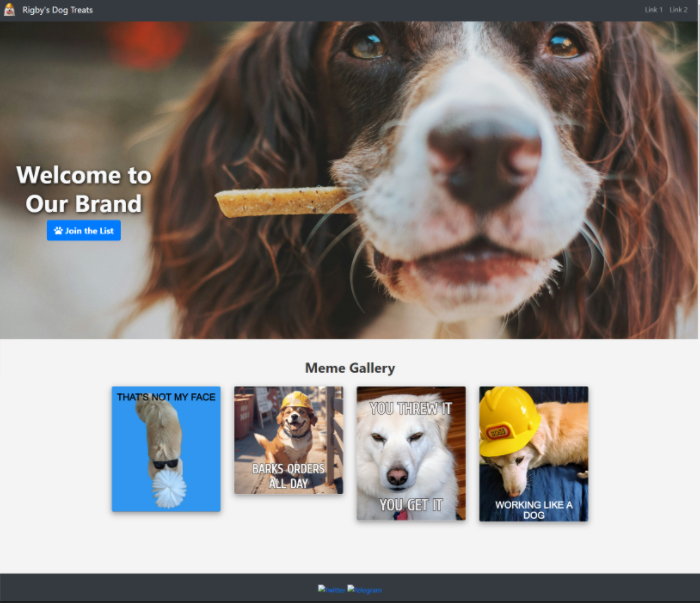

The website
Is AI Replacing Software Engineers?
You might have heard Nvidia’s CEO, Jensen Huang, suggest that AI will dramatically impact the software industry by reducing the need for developers. Having used GPT-4 to generate a lot of code, I can safely say we have a ways to go before it replaces skilled people, but it’s still an incredibly powerful coding tool. Regardless of whether Jensen’s prediction will come to fruition, there will always be a need for people who have the skills and ability to understand complex problems. If you want to learn to program, go for it — Don’t let a billionaire CEO discourage you from improving yourself!
Skills for a new era — The Prompt Engineer
With the rise of AI comes the need for a new skillset: Prompt Engineering. Prompt engineering is the ability to use natural language to interact with a large language model, like ChatGPT, and get your desired output. With that said, I’m putting both my prompt engineering skills and GPT-4 to the test to see how easy it is to create a basic website template that includes HTML, CSS, and JavaScript.
The challenge
I want to create a landing page for a new (fictional) business, Rigby’s Dog Treats. Companies like Canva, Wix, Unicorn Platform, and many others make it super easy to create landing pages, but oftentimes make it cumbersome to fully customize the code under the hood. If I want to implement a unique style down the road, I might be better off building something from scratch.
For this challenge, I’m going to limit myself to a maximum of five prompts, each 150 words or less.
I want to see how well GPT-4 can generate a basic, responsive landing page that includes the following:
- A navigation bar that contains an image, site name, and two links
- A section in the body that contains a large background image, headline, and a subscribe button that opens a modal with a field for a user to enter an email address.
- A section in the body for a meme gallery. Each row in the gallery should contain 4 images.
- A basic footer with 2 links to my social media pages
I challenge you to put your prompt engineering skills to the test and send me an image of the website you create! The complete GPT-4 conversation and webpage code is available on my Github.
Prompt 1: Creating an HTML template and navbar
The first prompt will be used to generate the core HTML template and the navbar code. In addition to the specifications, I want the navbar to be dark themed. Here is my first prompt:
I need to create a fully responsive, modern landing page for my brand. Using HTML, CSS, and Javascript, help me create the website. Use Bootstrap CSS.

Start by providing an HTML template.

Next, I want a navbar that meets these specifications:

Website navigation bar that contains an image, site name, and two links. The two links should be off to the right.

Style it to look, dark, sleek, and modern, and responsive.
Analyzing the response to prompt 1
Within seconds, GPT-4 produced the code to get me started. It output three sections:
- The HTML Template
- The Navbar
- Navbar customized CSS
As expected, the navbar is pretty simple, but it looks about as described. I added an image to the placeholder spot to see how it looks:

The navbar
Here is the code it generated for the navbar:
<nav class="navbar navbar-expand-lg navbar-dark bg-dark">
  <a class="navbar-brand" href="#">
    <img
      src="image_url.png"
      width="30"
      height="30"
      class="d-inline-block align-top"
      alt=""
    />
    your website name
  </a>
  <button
    class="navbar-toggler"
    type="button"
    data-toggle="collapse"
    data-target="#navbarNavAltMarkup"
    aria-controls="navbarNavAltMarkup"
    aria-expanded="false"
    aria-label="Toggle navigation"
  >
    <span class="navbar-toggler-icon"></span>
  </button>
  <div class="collapse navbar-collapse" id="navbarNavAltMarkup">
    <div class="navbar-nav ml-auto">
      <a class="nav-item nav-link" href="#link1">Link 1</a>
      <a class="nav-item nav-link" href="#link2">Link 2</a>
    </div>
  </div>
</nav>
The code follows the rules, using bootstrap CSS, and acts responsive. When the screen size is small, the links in the navbar collapse to a burger button. Overall, GPT-4 did a fine job.
Prompt 2: Creating the call-to-action section
The navbar was no sweat for GPT-4, but let’s see how well it interprets my prompt for the call-to-action portion of the landing page. In addition to putting some text over a background image, I also want a button users can click and enter their email to join my mailing list.
As a background, I’m using an Unsplash image by James Lacy. For the button, when clicked, I want a modal to popup and a JavaScript function to validate the entered text is an email address. Then it will simply log the email to the consol. In a real version of the site, I’d save those emails to a database, but that is beyond the scope of this challenge.
Here is prompt number two:
Great.

Next, in the body of the webpage, I want a section that contains a large background image, streched across the screen.

On top of the image, I want my headline text. Style the text to stand out and draw attention.

Below the headline text, I want a call to action button that says Join the list.

When the button is clicked, it should open a modal with a field that lets the user submit their email address.

When the submit button is clicked, validate the email and log it in the console. Complete this action using a Javascript script.
Analyzing the response to prompt 2
Once again, GPT-4 quickly produced step-by-step instructions with code to implement my specifications. I put things together, and this is the output of the page, along with the functional button and modal:
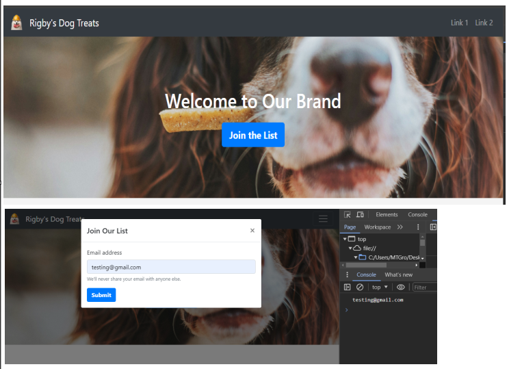
The JavaScript it produced works as expected. It uses some regex logic to try to validate the submitted string is an email address and logs the output to the console:
document
  .getElementById("emailForm")
  .addEventListener("submit", function (event) {
    event.preventDefault();
    var emailAddress = document.getElementById("emailAddress").value;
    if (validateEmail(emailAddress)) {
      console.log(emailAddress);
      $("#emailModal").modal("hide");
    } else {
      alert("Please enter a valid email address.");
    }
  });

function validateEmail(email) {
  var re = /^[^\s@]+@[^\s@]+\.[^\s@]+$/;
  return re.test(email);
}
The page turned out alright, but the background image doesn’t look as expected. I want it to show more of the dog.
<section class="bg-image-section">
  <div class="container text-center">
    <h1 class="headline">Welcome to Our Brand</h1>
    <button
      type="button"
      class="btn btn-primary btn-lg"
      data-toggle="modal"
      data-target="#emailModal"
    >
      Join the List
    </button>
  </div>
</section>
We can show more of the background image by modifying the CSS that GPT-4 gave us.
.bg-image-section {
  background: url("background-image-url.jpg") no-repeat center center;
  background-size: cover;
  padding: 100px 0;
}
By increasing the padding, we can effectively make more of the image to display. But, since this is a prompt engineering challenge, not an “Eric codes” challenge, I’m going to use my 3rd prompt trying to get GPT-4 to improve the look of this section.
Prompt 3: Adding a meme gallery and improving the style
Adding a meme gallery is just a way to share funny animal pictures with users. It is also a good test to see if GPT-4 keeps the style consistent between large sections. Here is my prompt to get it to improve the style of the previous section and create the new meme gallery section:
Help me improve the style of the bg-image-section.
The background image doesn't fully display.
Either increase the padding or re-create the CSS so the background image displays appropriately.

Next, Create a new section for a meme gallery.
Give the section a header to keep it separate from the call-to-action section.
Use bootstrap CSS to keep it responsive.
Each rows should contain 4 memes.
Give the section modern styling.
Analyzing the response to prompt 3:
After adding the new code that was output, and adding my images into the placeholders in the meme gallery, this is what the page looks like:
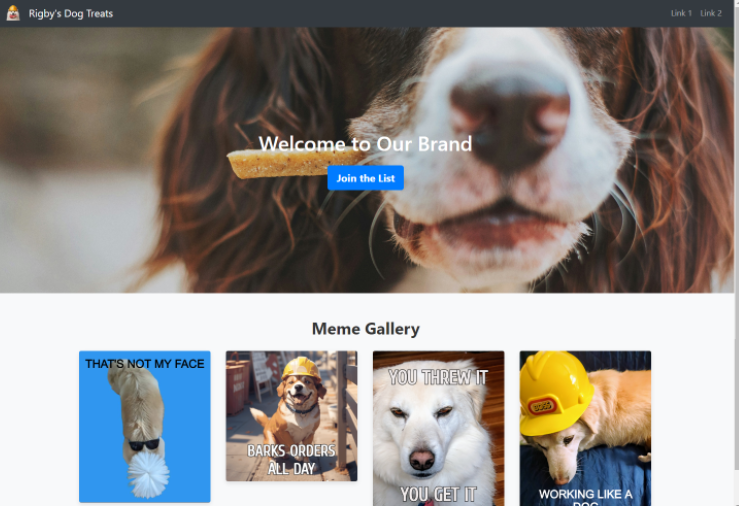
The site after implementing prompt 3
The meme gallery turned out to be pretty basic. I was hoping GPT-4 would automatically produce something that popped a bit more. My lack of specificity in my prompts is likely the problem, not GPT-4’s lack of coding ability. Here is the HTML it output for the meme gallery:
<section class="meme-gallery py-5">
  <div class="container">
    <h2 class="text-center mb-4">Meme Gallery</h2>
    <div class="row">
      <div class="col-lg-3 col-md-6 col-sm-12 mb-4">
        <img src="meme1.jpg" class="img-fluid" alt="Meme 1" />
      </div>
      <!-- Repeat for more memes as needed -->
    </div>
  </div>
</section>
The call-to-action background still isn’t displaying the way I imagined, but GPT-4 did add padding like I asked. The new CSS came out like this:
.bg-image-section {
  background: url("background-image-url.jpg") no-repeat center center;
  background-size: cover;
  padding: 200px 0; /* Increased padding */
  color: #fff;
  display: flex;
  justify-content: center;
  align-items: center;
  flex-direction: column;
}
Prompt 4: Adding a footer
I want to add a footer with a basic look and feel that includes the standard copyright wording along with some social media links. Additionally, I want to continue to tweak the style to see if we can get something that captures attention. Here is prompt number four:
For the background image, I want the entire image to display. Here is the CSS:

.bg-image-section {
background: url('background-image-url.jpg') no-repeat center center;
background-size: cover;
padding: 200px 0; /* Increased padding */
color: #fff;
display: flex;
justify-content: center;
align-items: center;
flex-direction: column;
}
Also, I want the text in the section bg-image-section to be moved a little to the left. Make words stand out more to really grab attention.

Also, create a footer section that displays 2 social media links and a copyright statement. I want a link to my Twitter and a link to my Telegram. Include images for the social media sites.

Keep everything responsive using bootstrap.
Analyzing the response to prompt 4
The footer came out matching the style of the navbar. As expected, it kept it simple and put in the sample text that I wanted. Here is the HTML GPT-4 produced:
<footer class="bg-dark text-light py-4 mt-5">
  <div class="container text-center">
    <a href="https://twitter.com/yourusername" target="_blank">
      <img
        src="twitter-icon.png"
        alt="Twitter"
        style="width: 40px; height: 40px;"
      />
    </a>
    <a href="https://t.me/yourusername" target="_blank">
      <img
        src="telegram-icon.png"
        alt="Telegram"
        style="width: 40px; height: 40px;"
      />
    </a>
    <p class="mt-3">© 2024 Your Brand Name. All rights reserved.</p>
  </div>
</footer>
When implemented, it looks like this on the page:

Image of the footer
While the footer turned out fine, the changes to the style left a bit to be desired. The CSS for the background-size was changed to “contain” from “cover,” resulting in two columns of white space on both sides. Once again, these are the situations where being a good prompt engineer really makes a difference because GPT-4 seems to do better when given specific instructions compared to just telling it to do things like, “move the text” and “make xyz stand out.” By telling it somewhat generic instructions, I’m left with mediocre results:
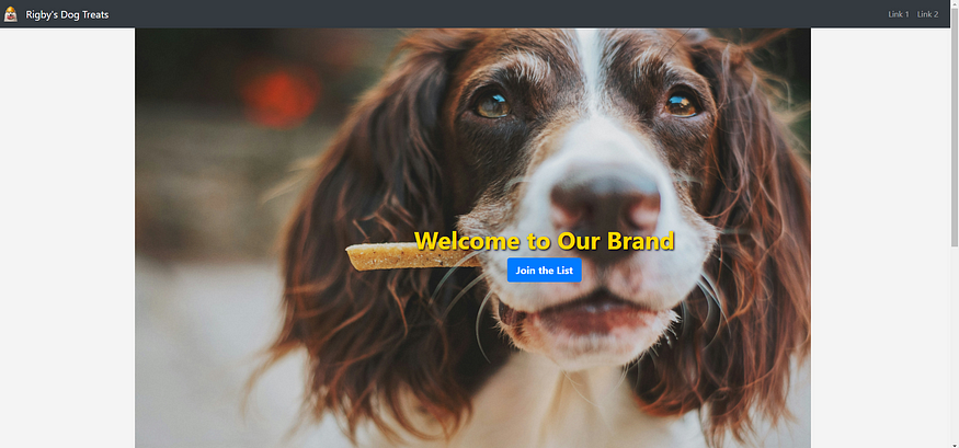
The updated style of the call-to-action section.
While it technically did what I asked, the output doesn’t look better than something that could easily be done with a popular site-builder tool.
Prompt 5: Tweaking the style once more…
At this point, the template is mostly done. We have a navbar, call-to-action, meme gallery, and footer. And it only took 4 prompts and around 10 minutes to put it all together. Clearly GPT-4 can handle building simple web pages.
For my last prompt, I’m going to get specific with the styling requests.
I have a few more tweaks to the style I need help with:

Change the CSS for .bg-image-section back to 'cover' and set the padding to 325.

Move the headline text and the button to the right so they are on the first 1/4th of the screen.

Enhance the CSS for the meme gallery but putting the images into cards and use a bit of shadow to make them pop off the backgound..

The meme images should get larger when I hover over them.

Use font awesome to add a paw print icon to the "join the list" button.

Change the .headline CSS to a slightly larger font, set it to an off-white color and make it stand out.
Analyzing the response to prompt 5
Being more specific definitely made a difference.

The call to action section seems appropriately padded to show the proper image. The text and button are off to the side, not colliding with the image. The meme gallery pops a bit more and is a little animated, via CSS transition styling.
Wrapping Up
Overall, I’d say GPT-4 passed this challenge with ease. We learned that the outcomes are better when our prompt is very specific, and that GPT-4 can definitely help create a basic landing page even if you have little experience with HTML and CSS. The content it output is easy to put together too as it gives great instructions for each section of code.
Challenge Accepted?
Once again, I challenge you to put your prompt engineering skills to the test and build a webpage using five prompts or less, each with 150 words or less. If you do, be sure to share it with me on linkedIn!
Thank You!
- If you enjoyed my work, follow me on Medium for more!
- Let’s connect on LinkedIn
- Analyze Data using Python? Check out my website!
POSTS ACROSS THE NETWORK

Best Programming Blogs for JavaScript and Frontend Development (2026 Curated List)
Building a Secure Cloud Studio: How I Architected a Locked-Down Adobe Creative Cloud Environment on AWS
AWS CloudWatch Monitoring on EC2 — A Complete Hands-On Lab

Pair Coding vs. AI: Why Your Best Coding Partner Still Has a Pulse
